
All things trends, social media, luxury and marketing
From curated case studies to insights on strategy, creativity, and community
EDITORIAL
THE

By A Management is a boutique digital agency in Zurich known for producing social media content that meets the highest standard of quality. We work with brands that expect their online presence to reflect the same level of care as their products and services. For us, premium content is not defined by budget or by the software used. It is defined by precision, consistency and a clear creative framework. Premium content is not about expensive tools or chasing trends. It is about applying clear, repeatable principles that make every design decision intentional. Over the years we have developed a framework that guides our creative process and ensures that everything we produce meets a consistent standard of excellence.
This article explains that framework. It outlines how to design content that feels elevated and cohesive, using practical methods that anyone can apply. These are the standards we use internally to evaluate our own work and they are the same standards we believe every brand should adopt to achieve a truly high-end presence.
1. Give Your Content Room to Breathe


Premium content does not crowd the viewer. It invites them in. Generous margins and intentional negative space immediately signal refinement. A layout that feels spacious shows that you are not fighting for attention; you already have it. This approach allows every element to stand on its own, rather than competing in a noisy frame. It gives the eye somewhere to rest and the mind somewhere to settle, so the content feels curated rather than crammed. In this calm, intentional environment, every word, image, and detail becomes more vivid because you’re not just looking at them, you’re actually seeing them.
2. Prioritise Consistency
Luxury design respects structure. Clear size differences between headings, subheadings, and body copy make your content effortless to read. Spacing should feel measured. Consistency builds trust, if your audience sees harmony across the feed, they perceive quality before they even engage with the words. It’s important to use the same font consistently across your feed to maintain a unified voice. Every brand should define its own title font, subtitle font, and body font. When visuals and typography speak the same language, your audience senses quality before they have even read a word. They feel the harmony first, and only then do they hear the message.
3. Colour with Intention
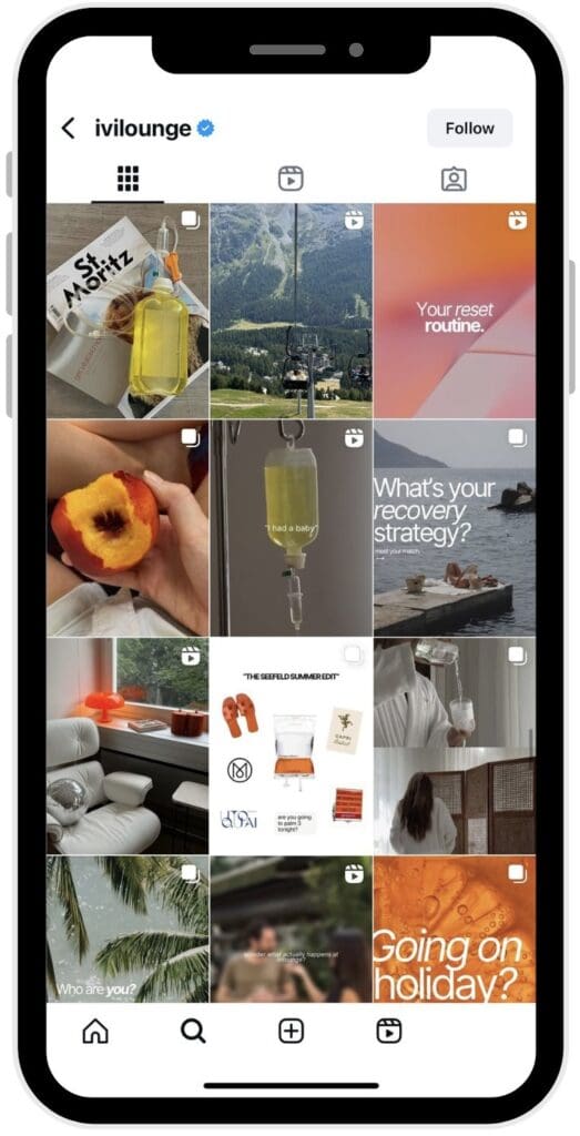
An expensive brand never uses colour by accident. Select one dominant color and use accents sparingly. Think of your palette as a wardrobe: the fewer colours you wear, the more timeless your look becomes. A cohesive colour story communicates sophistication and discipline, two things every premium brand should embody. And when a brand owns a signature colour, it becomes powerful even in the absence of a logo. People recognise it instantly, the way you recognise a voice in a crowded room. Colour, when used with restraint and precision, becomes as iconic as a name.
4. Design for Flow, Not Symmetry
Balance does not mean everything must be perfectly centred. True design balance guides the viewer’s eye intentionally, from the first glance to the final detail. The weight of your visuals should feel distributed, with every element placed to direct attention rather than scatter it. This approach catches the eye and makes your design more interesting without ever tipping into chaos. Deliberate placement gives a layout energy, rhythm, and flow, while still maintaining harmony.
5. Keep Every Touchpoint Cohesive
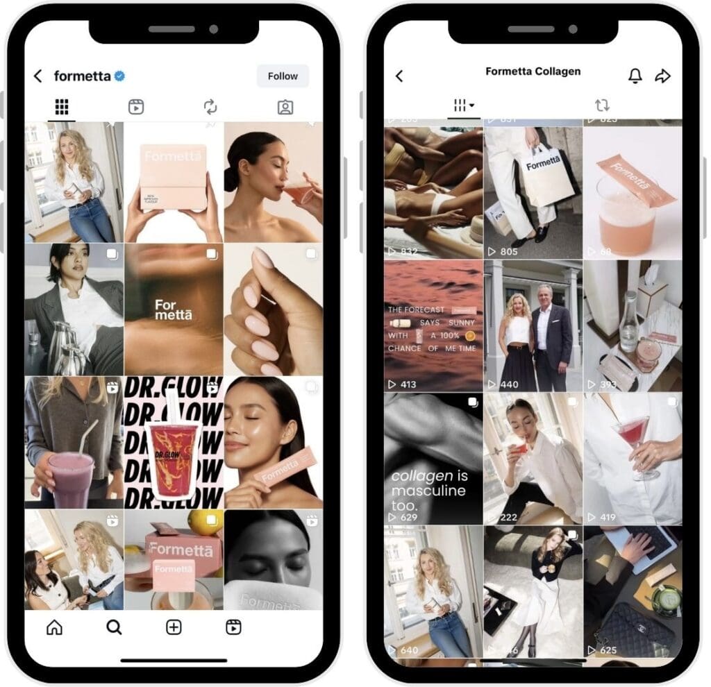
Expensive-looking content is consistent across all platforms. The same font pairings, logo placements, colour schemes and graphic styles should echo from platform to platform. When your audience scrolls through your feeds or taps through your stories, they should feel they are moving through a single curated world rather than jumping between disconnected pieces. At the same time, it is important to respect the nature of each platform. Instagram often favours a clean and polished look, while TikTok feels more spontaneous and real. The tone can adapt, but the underlying visual identity must remain recognisable so that every touchpoint still belongs to the same brand.
The Golden Rule
Every Design Choice Must Serve the Message.
Fonts, colours, margins and layouts are never decorative extras but tools to communicate clearly and consistently. When every element supports the content rather than competing with it, the result is refined and recognisable. The real difference comes from applying all of these principles together rather than treating them as separate ideas. Negative space, consistency, colour discipline, flow and cohesion work as a single system. When combined, they create content that feels premium.
At By A Management, this principle guides every piece of content we create. A guide we apply to every carousel, every story, every piece we create. Premium content is not a matter of budget or software. It is a matter of discipline, clarity and an unwavering standard. Apply these principles, and your brand presence will not just look more expensive but it will feel truly high-end.
Leave a Reply

– anabel, ceo & founder
Do what you love and love what you do.
Behind our articles stands a team of strategists, marketing experts, and creatives who don’t just talk about digital success – we build it every day. At By A Management, we believe in transparency, expertise, and showing our work. This editorial is your backstage pass to our thinking, our process, and our people.
By A Management is a growing boutique creative agency based in Zurich and Madrid. We specialize in social media, content creation, and strategy-led brand growth for luxury, wellness, lifestyle and fitness brands.


