
All things trends, social media, luxury and marketing
From curated case studies to insights on strategy, creativity, and community
EDITORIAL
THE
…and should not be random.
Before imagery, before colour, before copy, there is type. The moment a viewer encounters a brand name, their mind begins forming associations. Is it refined or relaxed, authoritative or playful, timeless or experimental? These judgments happen within seconds, and typography is leading the conversation.
The elegance of a high contrast serif carries a sense of heritage and sophistication. The precision of a geometric sans serif suggests clarity and modern intelligence. The softness of rounded letterforms feels welcoming and human. Typography shapes personality with remarkable efficiency. It frames how the audience should feel long before they process what they are reading.
This is why typography is not decoration. It is positioning.
Emotion in Every Detail
Luxury brands have long understood that typography holds emotional weight.
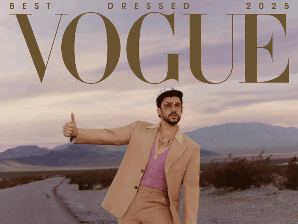
Consider the masthead of Vogue. Its refined, high contrast serif does more than identify a publication. It signals authority, legacy, and cultural relevance. The typography itself feels elevated, and that elevation extends to everything it touches.
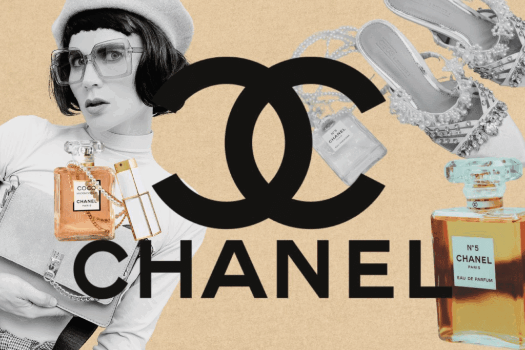
The wordmark of Chanel communicates discipline and enduring elegance through its balanced, understated letterforms. Nothing feels excessive. Nothing feels accidental. The restraint is intentional, and that restraint becomes synonymous with the brand.
When Saint Laurent introduced its bold, modern typographic identity, it shifted public perception in a profound way. A change in letterform reshaped the narrative of an entire house. This is the power of typography. It can refine a story, modernise it, or completely redefine it without altering the core name itself.
Typography holds emotion in its curves, its spacing, its weight. It influences trust. It suggests value. It can make a brand feel intimate and approachable or distant and aspirational. These subtleties are not minor details. They are strategic decisions.
The Architecture of Presence
Great typography functions like architecture. It creates structure, hierarchy, and rhythm. It guides the eye effortlessly, allowing information to unfold with clarity and confidence. When executed with intention, typography makes a brand feel inevitable, as though it could not exist in any other form. Hierarchy determines what commands attention and what supports it. Spacing creates breath and balance. Scale establishes dominance or discretion. Even the smallest adjustments in kerning or leading can transform the mood of a composition. Tight spacing may create intensity and modern tension, while generous spacing evokes luxury and calm assurance.
At By A Management, we approach typography as a system rather than a singular choice. A primary typeface establishes the voice of the brand. Supporting styles create contrast and flexibility. Together, they build a cohesive visual language that flows seamlessly across digital platforms, print materials, packaging, and spatial environments. Consistency in typography does not create rigidity. It creates recognition, and recognition builds authority.
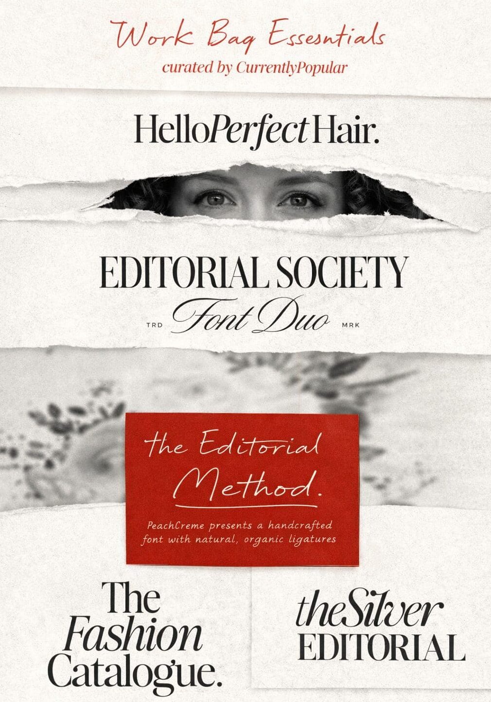
Here are some fonts we, at By A Management, love to use:
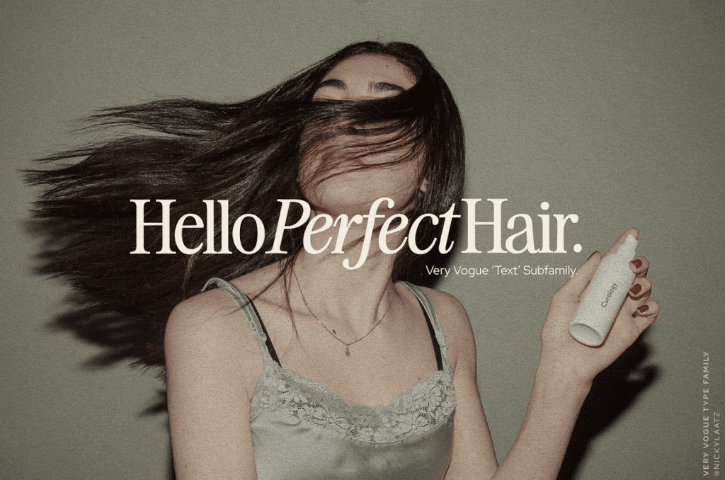
Hello Perfect Hair
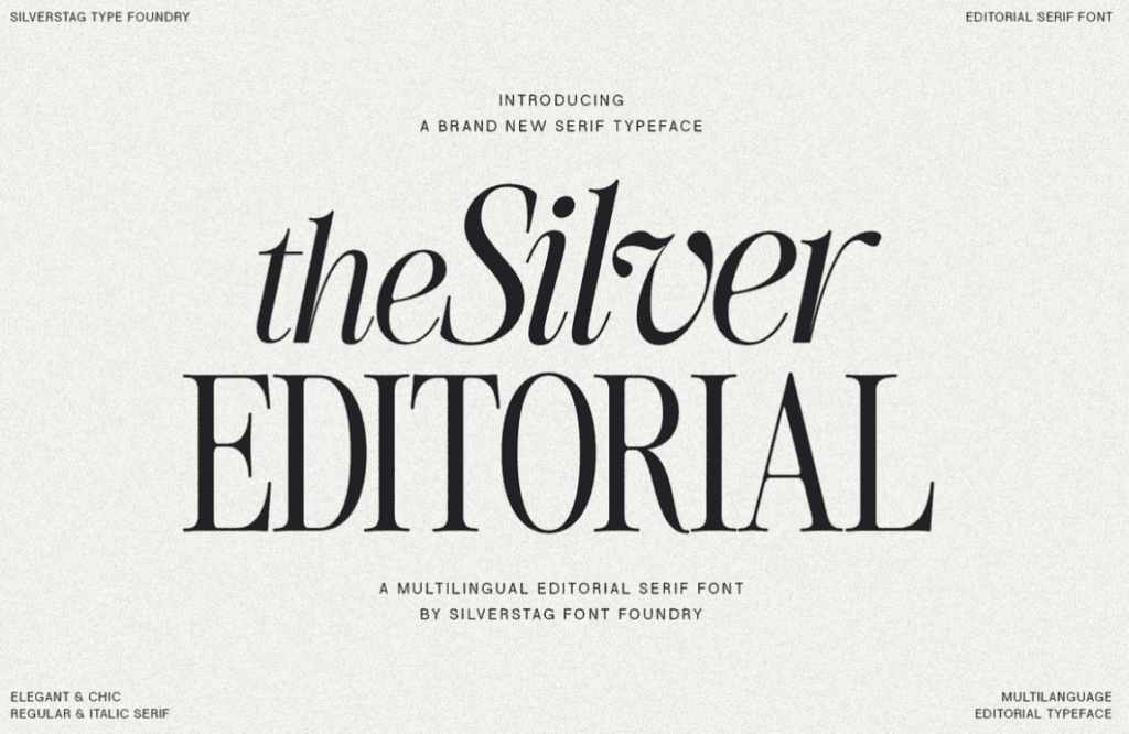
The Silver Editorial
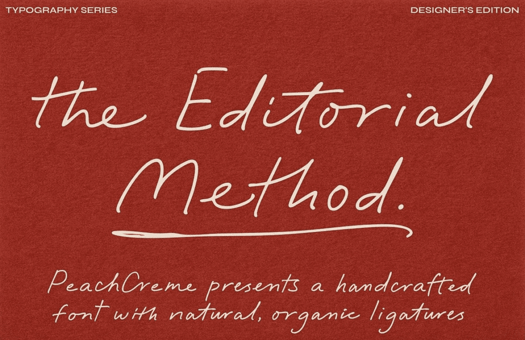
The Editorial Method
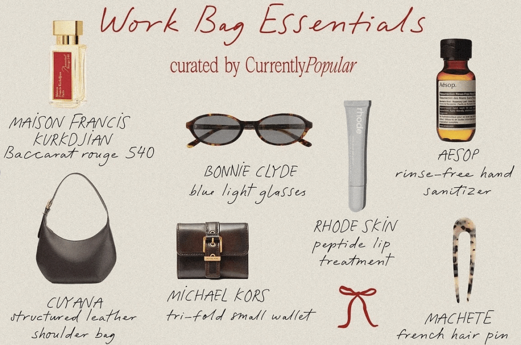
Work Bag Essentials
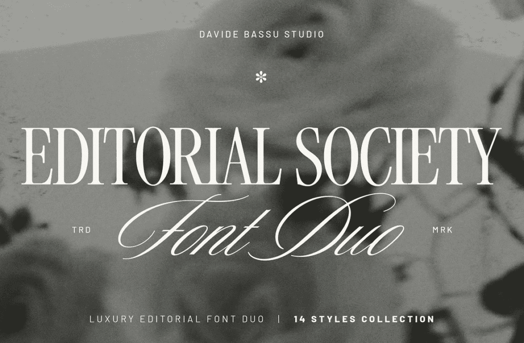
Editorial Society Font Duo
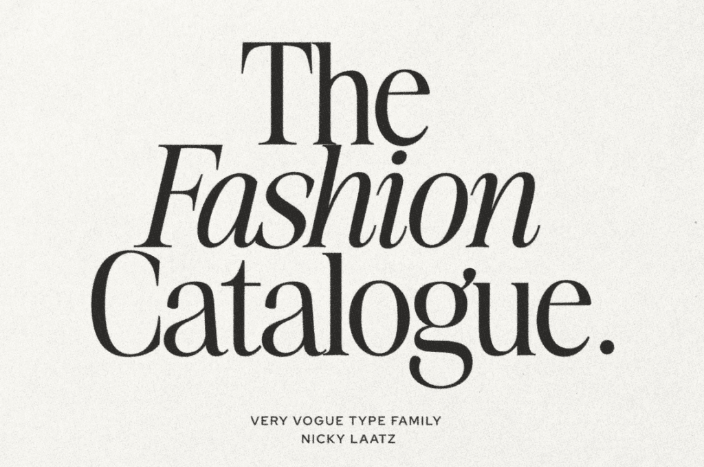
The Fashion Catalogue
The Psychology of Trust
Typography operates on a psychological level that many underestimate. Research in cognitive perception consistently shows that people assign personality traits to typefaces. Serif fonts are often perceived as trustworthy and established. Clean sans serifs feel transparent and progressive. Expressive scripts can convey intimacy or artistry. These perceptions are subconscious, yet they directly influence credibility.
When typography aligns with a brand’s values and audience expectations, it reinforces trust. When it conflicts, it creates subtle friction. A wellness brand presented in harsh industrial type may feel unapproachable. Alignment between message and typography is essential. It ensures coherence not only in appearance but in perception.
When we compare a consistent feed to one where typography shifts constantly, the difference is not merely visual. It is psychological. A feed grounded in one clear typographic system feels structured, intentional, and secure. The repetition of letterforms builds familiarity, and familiarity builds trust. The audience may not consciously notice the consistency, but they feel it.
Luxury in Restraint
True luxury rarely relies on excess. It is found in precision, in balance, in confidence. Typography embodies this philosophy beautifully. The most elevated brands often allow their letterforms to breathe within generous margins and disciplined grids. They understand that space is not emptiness. It is emphasis. A refined typographic system communicates certainty. It does not rely on visual noise to prove its presence. Instead, it allows clarity and proportion to speak. When typography is carefully considered, the brand feels composed and assured. It feels considered.
At By A Management, we see typography as the tailoring of a brand. Just as a perfectly cut garment enhances form without distraction, intentional typography enhances identity without overwhelming it. It frames the message with sophistication and control.
The Enduring Power of Type
Trends evolve. Visual styles shift. Digital platforms expand and transform. Yet typography remains the backbone of identity. The strongest brands in the world can often be recognised by their letterforms alone. Remove imagery, remove colour, and the type still carries the essence. That endurance is what makes typography powerful. It holds memory. It creates familiarity. It builds legacy over time. In an era saturated with visual stimulation, typography offers clarity and grounding. It brings discipline to creativity and coherence to expression. It transforms language into experience.
At By A Management, we treat typography with reverence because we understand its quiet authority. It may not be the loudest element in a brand identity, but it is often the most enduring. When crafted with intention and aligned with purpose, typography does not simply support a brand. It strengthens it, elevates it, and ultimately defines it.
Leave a Reply

– anabel, ceo & founder
Do what you love and love what you do.
Behind our articles stands a team of strategists, marketing experts, and creatives who don’t just talk about digital success – we build it every day. At By A Management, we believe in transparency, expertise, and showing our work. This editorial is your backstage pass to our thinking, our process, and our people.
By A Management is a growing boutique creative agency based in Zurich and Madrid. We specialize in social media, content creation, and strategy-led brand growth for luxury, wellness, lifestyle and fitness brands.


